z NYSE 30 Minute Internal Readings

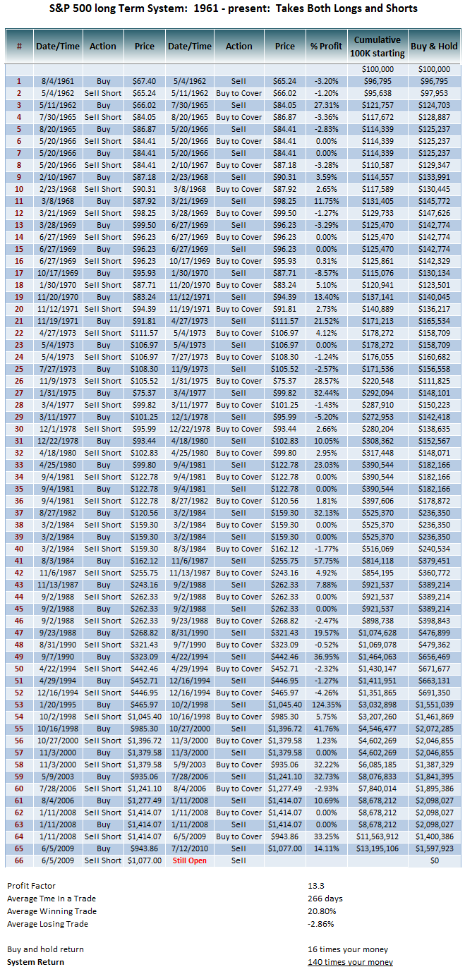
The long term SPX system that goes back to 1961 crossed over this morning for a sell signal. Technically the MA's crossed last week, however the way the code is written, since it's based on a weekly chart, I think it needed a new opening bar the next week (which is today) in order to trigger. I updated the table
Again treat this info how you wish. For me personally I can't trade this system because it's too long, doesn't fit my style, it's like watching paint dry since the average trade time is 267 days! However for someone who doesn't trade the market maybe it makes sense, like someone who works a busy job and only wants to make some well timed trades in 401K that is better than just buy and hold.
And of course, realize that the system has loses like any system, the average losing trade being about -2.9%, so it does whipsaw from time to time. Also sometimes the system will do a very short whipsaw trade where it does a trade that lasts for only a week and then reverses back; this happens in strong trends where it may short but then go back long again, however the majority of trades are many months as you can see from the stats. Keep in mind that this short trade could be a whipsaw losing trade in the end, or it could be a winner, there is no way to know at this time.
http://breakpointtrades.com/key_indicators/

If any of you took the GDX trade yesterday, here's an updated table. Per the system, your stop goes at 52.3, which is a 5% stop loss.
The previous Short trade was a losing trade, but only -0.7%. This current trade will either be a loser or a winner, that's how systems are.

Here's a daily chart of Crude oil, it is quite oversold on the daily, also the Crude/SPX ratio has crossed up for buy signal.
Also here's a 60 min chart of USO; bullish falling wedge with positive divergence, it appears that the 60 period stochastics crossing above 20% would be a good trigger for a Long


This is an example of how to watch the gap with the gap oscillator...this version shows a test of control on the downside, a failure to break out of the control zone and then a breakout to the upside of the control level. Also on this chart at the Cycle Analysis tool and synthetic price. Both of which are not yet in the store but may be released in the future.

The AIG system had an incredible day, making over 13%!!!
as a side note, this LinearRegSlope indicator (which I showed in last nights Newsletter on the SPX 60 min chart), appears to match the pivot signals very well, and many times it's better.

It's the end of the month, so this is relevant
also look at the other charts! Perfect back test and rejection on the IWM and RUT


Here's a chart example that I will have in tonight's Newsletter which will be posted later. However I also made a quick video to go over it: The contains a MACD, 13/34 EMA, custom Histogram, 60 period stochastics etc. One thing that stands out to me is the trendline and the Fibonacci retracements. Notice that the last pullbacks all retraced slightly more than 61.8% from the previous low, if this were to occur again, the SPX would go to about the uptrend line
here's the dynamic charts:
SPX 60 min setting - for Stockchart members
for non-Stockchart members, cut and paste the following URL into your browser
http://stockcharts.com/c-sc/sc?s=$SPX&p=60&yr=0&mn=2&dy=14&i=p10972496968&a=161963261&r=8430

Wow, here\'s an interesting chart of GE with the SPX. Notice how divergence in GE have correlated so well with tops and bottoms in the market! Almost uncanny, it\'s almost like GE is a MACD indicator lol


