Tomorrow 1 hr before the market opens the Initial Jobless claims will be released, obviously they will be heavily looked out.
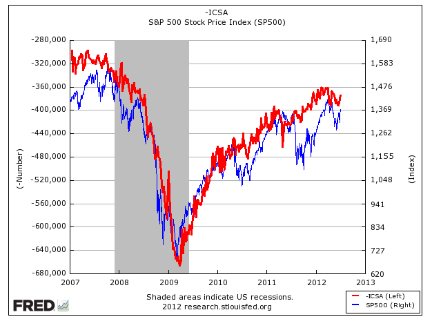
Here's an interesting chart of the Initial Jobless Claims (in red) plotted with the S&P 500 (in blue); while the correlation isn't perfect, it's pretty good and enough to get your attention. If the weekly jobless claims started to increase (move down - note the left side scale), the market will follow. Anyway longer term chart, but something to pay attention to over time.
http://research.stlouisfed.org/
No comments:
Post a Comment