The first chart shows a linear chart of AAPL, an uptrend line is in the upper $400's
the second chart shows a logarithmic chart, there is basically an uptrend line right in this area, if this is lost, then the uptrend line on the linear chart will likely be tested - honestly I wouldn't mind that as I think it would finally be a low risk buy
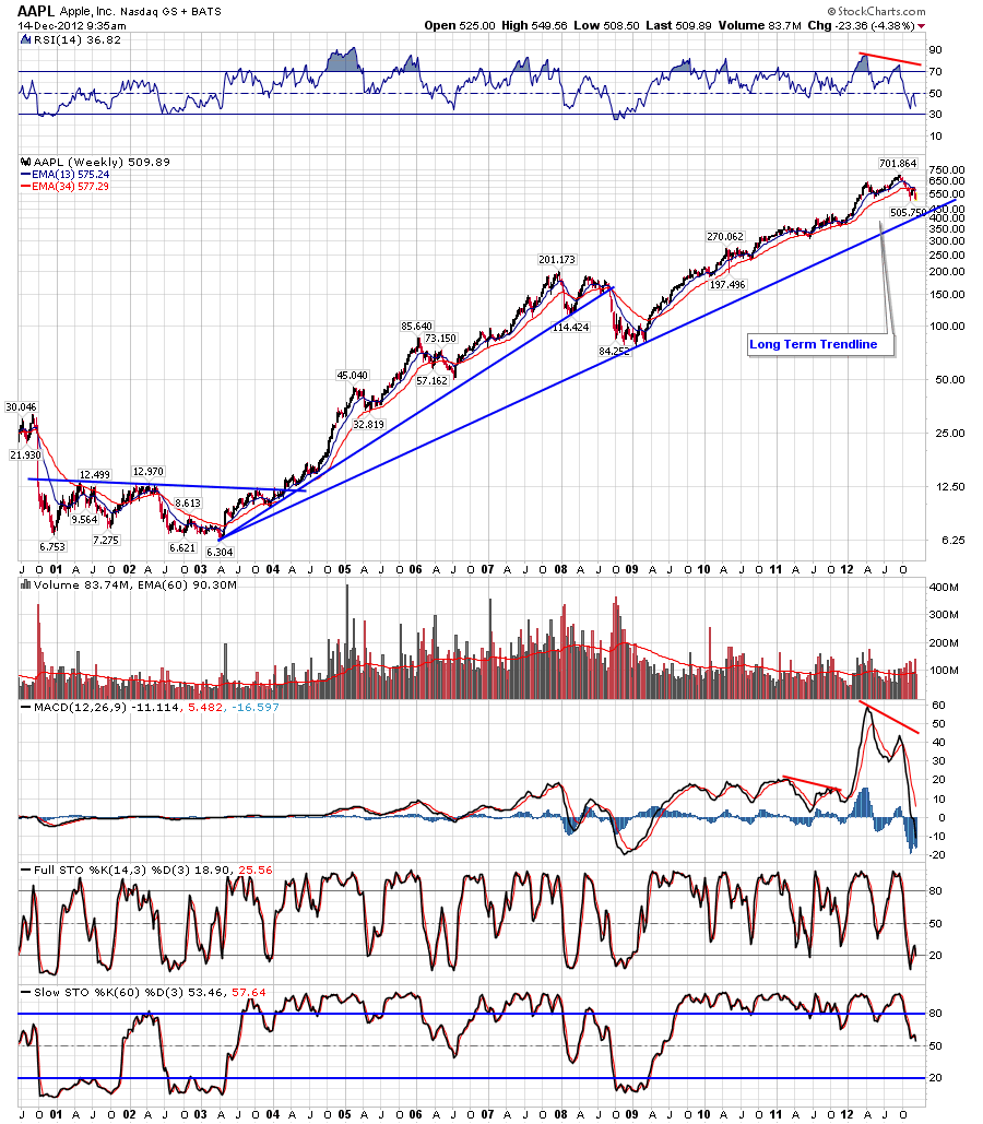
the third chart shows a weekly log chart going back 11 years, there\'s an uptrend line from 2003 that comes in the mid to upper 400\'s as well basically matching the daily linear chart above.


No comments:
Post a Comment