
Thursday, December 27, 2012
Last week on Dec 19th, I posted this custom indicator of ours which has been great at identifying at least short term tops in the market when the NYAD forms a negative divergence with respect to the S&P 500 - see the past examples. Anyway last week it was giving a warning sign for the market and a pending pullback, clearly this Fiscal Cliff fiasco in Washington has been a major catalyst, however you can't argue that the chart wasn't set up for a pullback ahead of time!


Wednesday, December 19, 2012
Chart of the day
Here's a chart from chartoftheday.com, it shows how typically the post election cycle is weaker than the average year - this is something that I have been discussing this year in the newsletters as well.


Tuesday, December 18, 2012
Gold comments
$GOLD - Chart Link - as you know, gold is down big today, -$29 currently. Per my weekend analysis, here's the symmetry chart (please be aware this chart still shows yesterday's closing prices). Gold is currently trading at 1670, so it's just above above all these moving averages. Also refer to the time frame of this consolidation, it's 16 months, the other two lasted 16.5 months and 17.5 months. Will the MA's hold or not?
$GOLD - Chart Link - anther daily gold chart with the wave count that I've been showing, as I have been discussing, if this is a wave (2) and wave C, then we can expect the Nov low to be undercut at least slightly
GLD - Chart Link - here's the ETF, steve made this chart up, shows a symmetry projection to the downside
remember the gold charts at Stockcharts don't update until well after the market close.


Monday, December 17, 2012
Our Recent Newsletter
Hello everyone, as you know, the market had a big rally today, therefore here's my most recent comprehensive newsletter on the market, AAPL, bonds/Rates, GDX, Energy, and tons and tons of trade ideas.
also please consider taking advantage of our 25% coupon, this expires on Jan 1st. Our membership rates will be going up next year, so now is a good time to take advantage of our special!
Friday, December 14, 2012
Technical Analysis of AAPL
The first chart shows a linear chart of AAPL, an uptrend line is in the upper $400's
the second chart shows a logarithmic chart, there is basically an uptrend line right in this area, if this is lost, then the uptrend line on the linear chart will likely be tested - honestly I wouldn't mind that as I think it would finally be a low risk buy
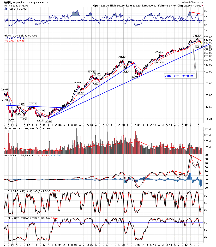
the third chart shows a weekly log chart going back 11 years, there\'s an uptrend line from 2003 that comes in the mid to upper 400\'s as well basically matching the daily linear chart above.


Thursday, December 13, 2012
Quick market update
Yesterday I posted a 60 min chart of the S&P 500, I showed how it stopped exactly at resistance (see the downtrend line with red arrows) and had also formed into a bear wedge pattern. Here's the original post from yesterday.
As you can see with today's sell off the wedge is playing out and gave folks an early warning sign to lighten up on Longs or even take a short position.

Wednesday, December 12, 2012
Intra day divergences education example
$SPX - Chart Link - here's a 3 min chart of the major indexes, one thing that is useful for day traders is to look for intra day divergences where one of the indexes makes a higher high but the others do not, and vice versa. Generally the Nasdaq and RUT leads, so for example today while the SPX made a higher high, the fact that the RUT and Nasdaq didn't was a warning. The same thing works for bottom i.e. if the SPX makes a lower low but the NDX and RUT make higher lows, that's a positive sign.
you can use this Stockchart URL going forward

GDX and bollinger bands example
Nice bounce so far for GDX and GDXJ, though GDX is still below the downtrend line so it has work to do, however last week we started pointing out that Bollinger Band W bottom scenario possibility as price had closed below the lower BB's in mid Nov but failed to do so on the new low in early Dec, and so far it has played out for a bounce anyway
also here's the education examples from Stockcharts.com


60 min SPX chart
$SPX - Chart Link - this was posted on our live blog this morning as you can see the market popped up after the FED meeting, but pulled back - see where it stopped? logically right at the downtrend line from early Oct. Now watch the potential wedge pattern

Tuesday, December 11, 2012
Here\'s our most recent newsletter
Hello everyone, here's our most recent newsletter covering the general market, some commodities, and of course tons of trade ideas, we've had a lot of really great trade ideas that have done well, here's the newsletter
Monday, December 10, 2012
Commodity Newsletter
Here's a link to our Comprehensive Commodity Newsletter, make sure to check it!
Commodity Newsletter - Precious Metals, crude oil, energy stocks, mechanical systems etc
Wednesday, December 5, 2012
Technical Analysis on AAPL
As you know, AAPL has had a nice correction since the September highs when it hit $700 a share. At the time we pointed out the negative divergence in place via the MACD.
In mid November AAPL bounced along with the general market, however it stopped dead at the 200 day MA and today AAPL lost about -6.5% which was the biggest down day in years on a percentage basis.
The second chart shows a 60 min chart, notice the bear wedge that had setup with negative divergence. One target to watch on this downside would be a fill of that gap below which is 528.9 - 539.9, at minimum I think that gap will be filled.
The third chart shows a weekly chart of AAPL. Note the long term uptrend line back to 2003.


MACD KISS method
As you know, I've shown various tips and tricks for you guys to add to your traders toolbox, I've shown alternative methods to using indicators by looking for a confirmed cross for MACD, moving averages, RSI etc, however here's something that you might not have thought of, I call it the Kiss method, and this video will be how to use it for the MACD. Most traders use MACD to either point out divergence, or to look for crossovers, however this is an alternative method that I came up with where instead of looking for crossovers, you take very low risk trades when the MACD touch one other or kiss. This is akin to buying support or selling resistance because your stops can be extremely tight - i.e. stop out if the MACD actually crosses. This method doesn't happen that often, however the nice thing about it is that it works on any stock or index and any time frame.
Here's a 6 min video I made on this method, as well as example charts
/
Tuesday, December 4, 2012
Market Views and comments
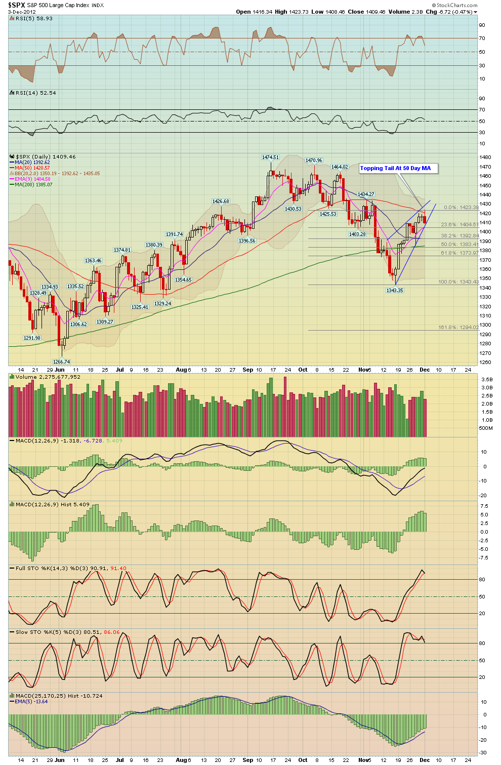
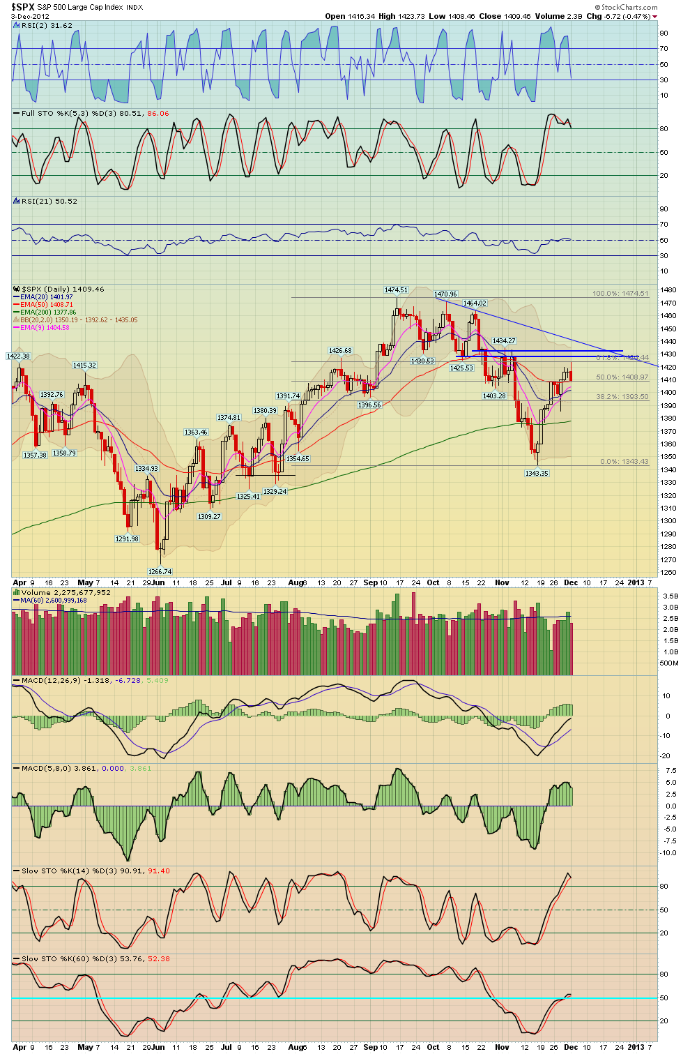
Here's three daily charts of the S&P 500, as you know the market had a nice rally off the mid Nov lows a few weeks back, however notice where the market stopped yesterday, it stopped dead a the 50 day MA! This was a logical place to exit longs or even take a low risk short with a tight stop. The first chart shows the reversal off the 50 MA, the second chart shows a small wedge pattern, while the last chart shows a higher level the market may try to hit should the 50 MA be broken.
A bullish scenario would have the market pulling back to form a RS of an inverse H&S pattern, however this would take at least a week or so since, so at best expect some chop in the market for the next week, at worst a decent top has been put in, however we are in the bullish time of year, so for now I favor some kind of higher low being established over the next week or two, we'll see...

Subscribe to:
Posts (Atom)