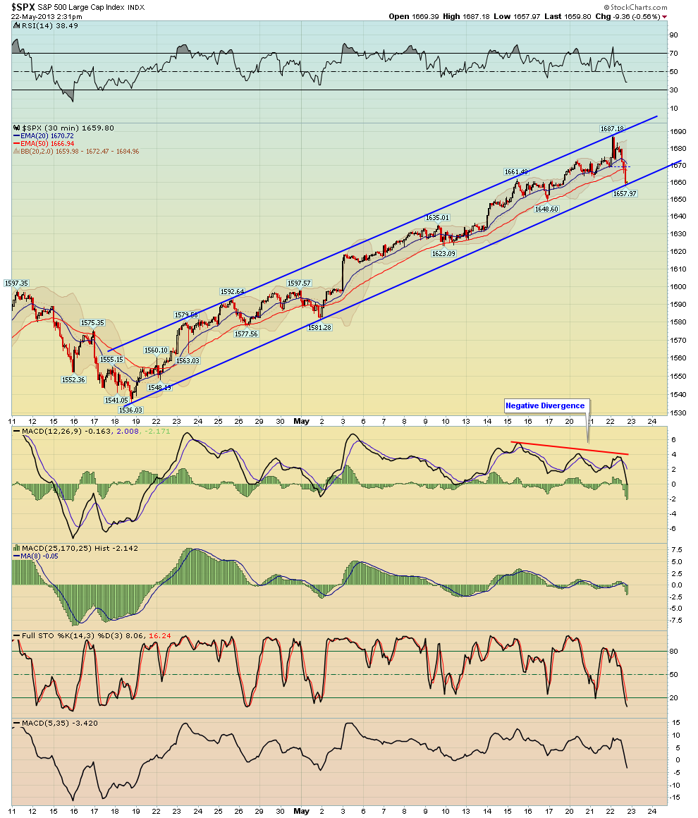
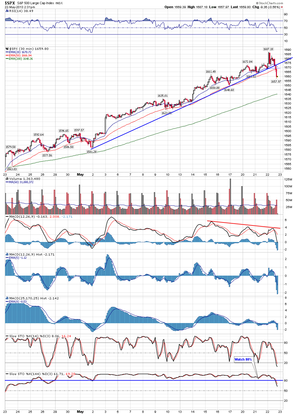
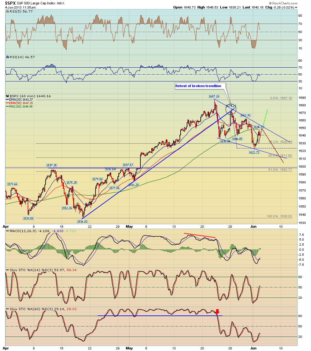
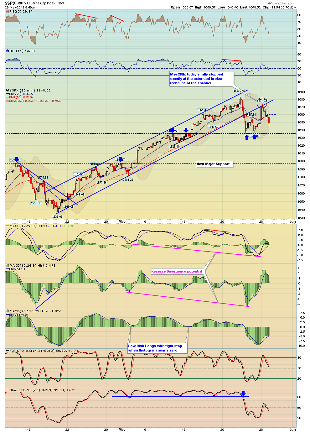
I posted this chart earlier, the S&P 500 was up today and is now down 14 points.
The bounce this morning was a perfect 'textbook' back test of the broken trendline - this also provided an outstanding low risk short trade against the S&P 500 today!
I posted this chart earlier, the S&P 500 was up today and is now down 14 points.
The bounce this morning was a perfect 'textbook' back test of the broken trendline - this also provided an outstanding low risk short trade against the S&P 500 today!

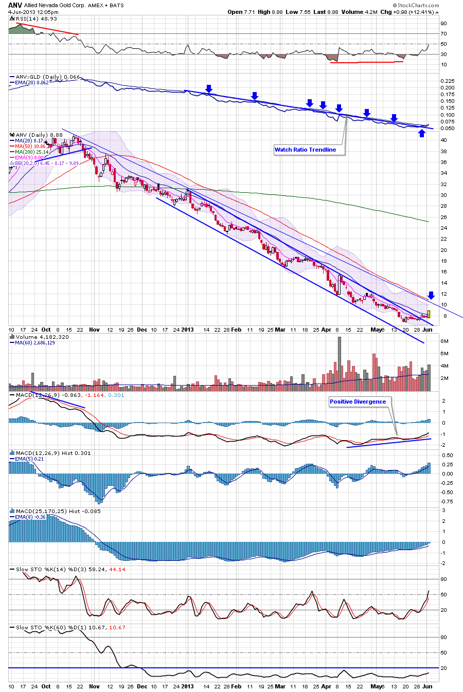
I posted ANV as a trade idea a while back, last week it finally broke the downtrend line on the price and on the ANV/GLD ratio, which was a bullish event. I especially find the ratio trendline breaks powerful for gold stocks.
The first potential target for ANV would be the 50 day MA in red, however because there was no base, I would then expect another pullback again - if the pullback is on lighter volume and forms a higher low, then one could try a swing trade with an initial stop at the higher low
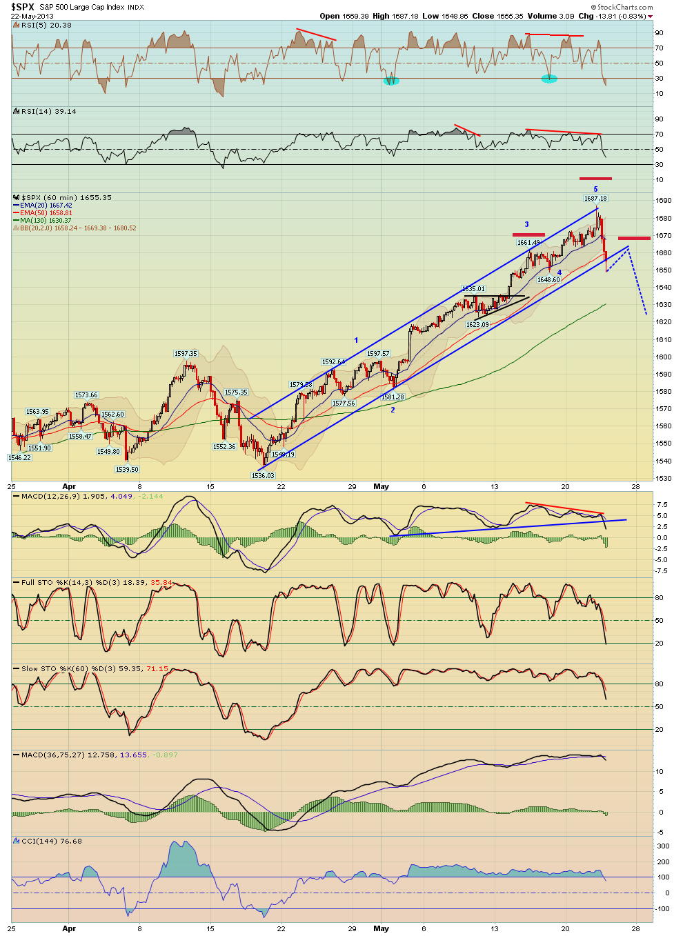
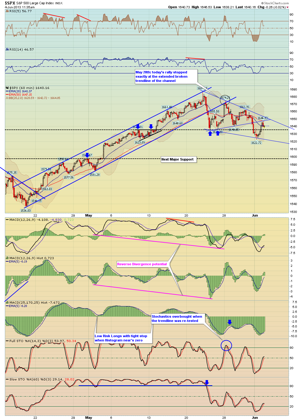
Here's a few charts from my newsletter last night - first off the SPX bounce from yesterday followed through this morning but notice that it stopped exactly at the broken trendline as shown on the 1st chart which is a 15 min chart.
The next two charts are 60 min charts showing a potential wedge pattern. Resistance is clearly the downtrend line of the pattern. The first 60 min chart also shows the same broken trendline as the 15 min chart which was re-tested today. The second 60 min chart shows wedge scenario with 2 possibilities i.e. once scenario would break out of the pattern while the other one would have another sell off inside the pattern to the low 1600's and high 1500's. The downtrend line is major resistance

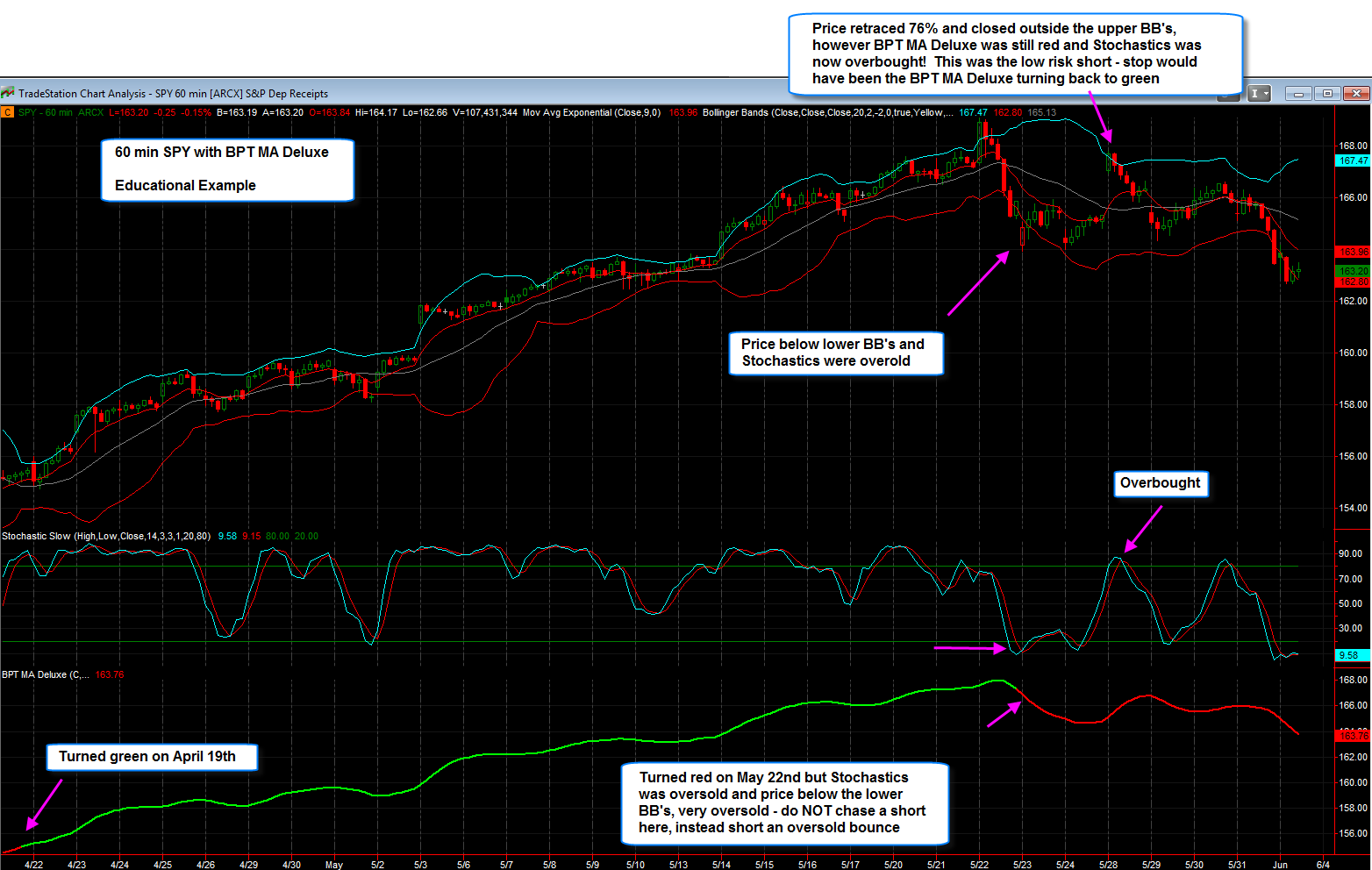
As you know I've been showing the BPT MA Deluxe indicator, which I've provided for free to members, however I've found that too many of you are treating this indicator as a system, which it is not; it's best to use it as a guide and a tool along with other indicators and price action.
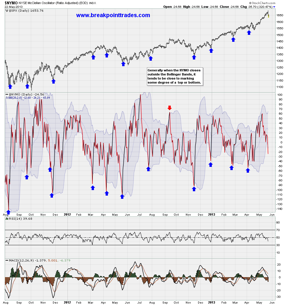
Here's a great example showing a 60 min SPY chart and how using the BPT MA along with price action, Bollinger Bands, and Stochastics to get a MUCH more objective short trade when this indicator finally turned red on May 22nd
**CLICK HERE** to watch a short 5 min video explanation
Also see the attached detailed chart example with written annotations - these are the type of things that I would like to discuss in a future webinar on how to use this indicator.

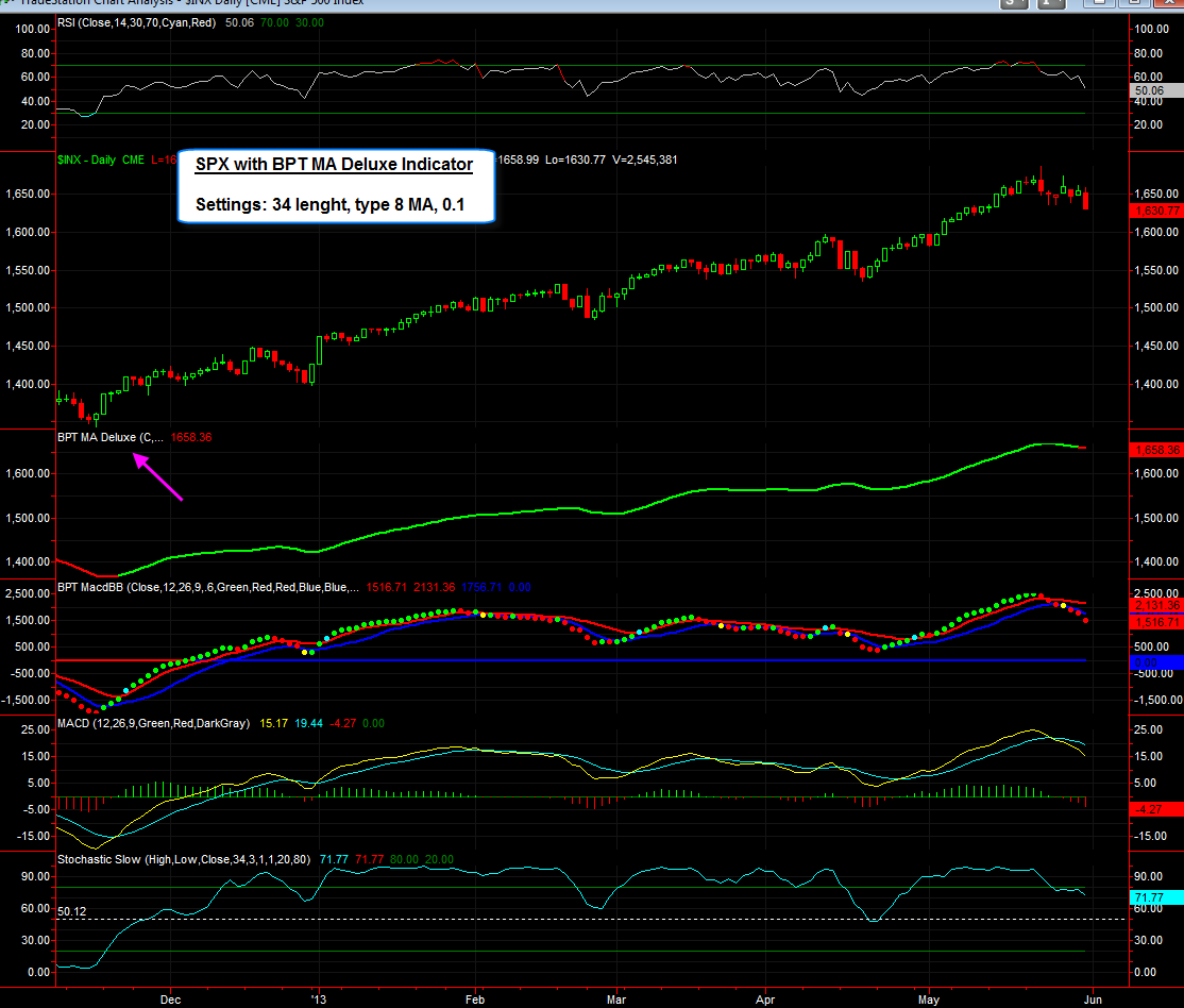
Here's the a daily and 60 min chart of the S&P 500 with the BPT MA Deluxe indicator, which I've shown before. As you know the 60 min version turned red on May 22nd, today the daily version finally turned red (it's been green since Nov 23rd). However remember this is NOT a system, its simply an exotic set of moving averages that that has a ton of settings that you can adjust. It is not a system and should always be used in conjunction with other analysis. Also please be aware that this indicator has NOTHING to do with the SPY reversion to mean systems.
Below is a write which discusses this MA set in more detail. Also note that as a BPT member you can get this indicator for free as well as these pre formatted workspaces, however you must have a Tradestation account and you must be a paying member, not a free trial member.
--------
Here's the BPT MA deluxe MA, which is really just a fancy name for a moving average set that has tons and tons of settings. It allows you to plot two MA's like at 20 and 50 or 50, 200 or whatever, and it also has 8 different moving average types that you can choose from (Simple, Exponential, Weighted, Triangle, Adaptive, Hull Weighted, Hull Expontial, and Hull Modified). we can also plot just one MA and turn off the second (which is what I show in the sample charts). It also slows the color of the slope of the MA (green when the slope is up and red when the slope is negative).
The last custom setting it has is a whipsaw factor. You've all seen my use the BPT confirmation method where you need a second candle to confirm the first candle of an indicator change, I've shown this with various moving averages, MACD crosses, RSI above or below 50%, stochastics above or below 50%. However I added a whipsaw confirmation method to this MA that only allows the slope to change color if it is confirmed by a second color - this turns it into more of a trending indicator. I've attached some images below of daily and monthly S&P 500 charts. The setting that I'm using is a 34 length exponential modified MA (our #8 MA) with the whipsaw confirmation turned on, as you can see it's done a great job at catching most of the trends.
For BPT members who have Tradestation I'm going to give you this indicator and a workspace for free so that you can play around with different settings and follow it on your own!
Again note that even though the indicator appears to follow trend very well, I still don't like to use it on its own, I use it as a tool with other things and analysis. For example on the monthly chart, I've found that whenever the RSI is oversold (which is a rare event on monthly charts), it's best to enter a long earlier than wanting for the MA to turn green - I've found taking the first MACD/BB green dot gets you in early (but only doing this when the monthly RSI was in a deeply oversold condition below 30%). The first three charts show monthly S&P 500 charts while the last 2 charts show daily S&P charts, one recent and while from the past.
On the daily charts as you can see it's been green since mid November so has caught this whole move.
**Click Here** to watch a detailed video of how this indicator works and how to use it
I will be giving this indicator to all BPT members for free who have a Tradestation account. However it's only for BPT members not free trial members (so sign up) if you want it.

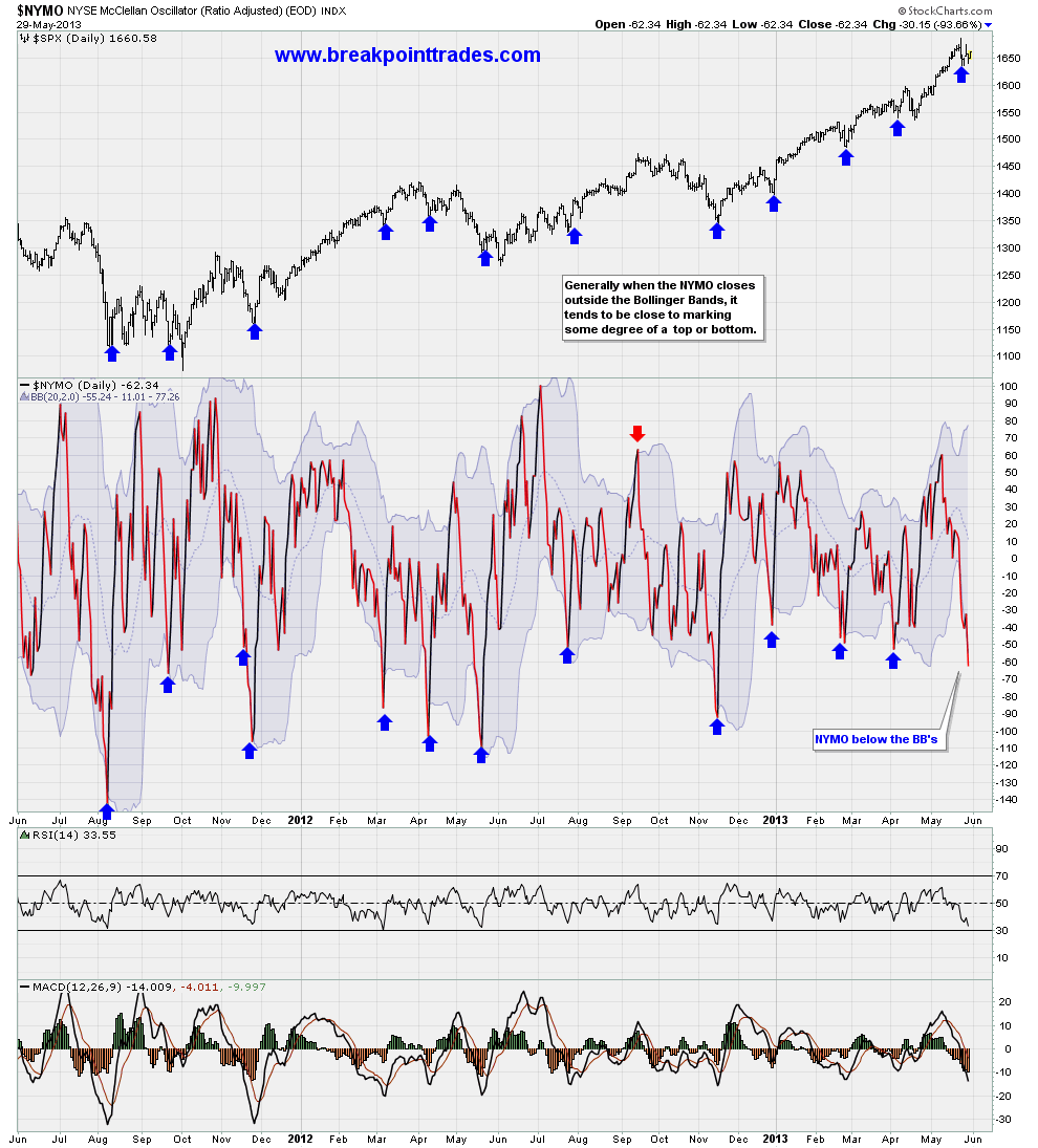
The market is up nicely today, why? Well take a look at one of our bottoming indicators, the NYMO plotted with Bollinger Bands along with the SPX plotted above for comparison. As you can see, every time the NYMO indicator has closed below its lower Bollinger Band, the market has bounced.
This is a powerful indicator for picking tradeable bottoms in the SPX and one of the many useful indicators available at Breakpoint Trades
Here's a follow up to the Unemployment chart that I did yesterday, LOL I found out that Stockcharts.com already has a lot of this data already, therefore I created some extra charts for us with indicators of major economic data:
The first chart shows the unemployment rate plotted with RSI, MACD, and Stochastics. Obviously MACD crosses can give nice signals as well as divergences that show in the RSI and MACD show major turning points such as in 2001 and 2007. The MACD has a negative cross in 2010 and since that time the unemployment rate has fallen.
The second chart is a plot of the U.S. GDP going back to 1980, obviously it's been uptrending since that time, however those of you who are ultra bears, notice the negative divergence that has been forming since 2008 i.e. the MACD is lagging GDX and forming a lower high. Perhaps this will eventually play out years later with a pullback in GDP and a contraction of the US Economy! However please realize this is a monthly chart so it may take a long time before it manifests. I also added the 4 length length ROC indicator, the zero level appears to be important long term.
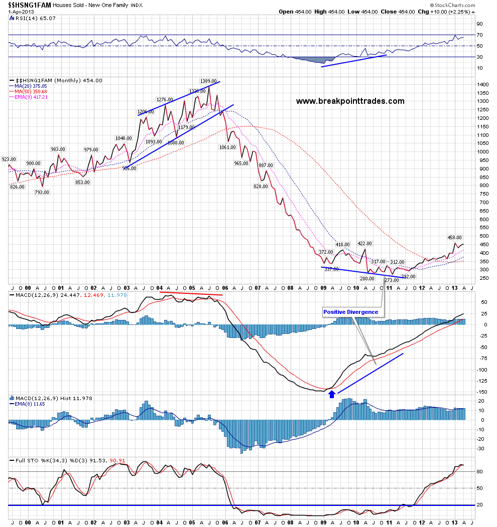
The third chart shows the new family houses sold - first off notice the negative divergence in the 2005/2006 time frame via the MACD and RSI indicators that logically ended the housing bubble as well as the bear wedge that was in place.
Also recently as base had formed with positive divergence between 2009 to 2012 which has lead to this somewhat what rebound in housing since last early last year
The 4th chart shows the Housing Starts and once again you see the same things as the Houses Sold chart, you see clear negative divergences and topping patterns at the end of the housing bubble in late 2005 that foretold the end of the housing bubble, and likewise you see some bottoming action that resulted in a bounce .
The last chart shows the Case Shiller Home Price index, as you cans see prices have recovered somewhat from the positive divergence that was in place from 2009 - early 2012, however housing prices have a LONG way to go before ever getting back to old levels from 2006.
This has been a fun exercise - I love that we are able to analyze economic data using standard technical analysis indicators which we use for trading. I think this represents a new way to analyze economic data going forward.


Over the weekend for fun (yes I'm a nerd I guess) I downloaded the monthly unemployment rate data from the Government Website (Fred) added it to Excel and I also added a MACD Indicator. My thought has always been that trends in economic data can be predicted using standard Stocktrading indicators like MACD, Stochastics, RSI etc. The unemployment rate especially because it tends to trend for long periods of time vs changing direction suddenly.
I've attached my chart and here's a quick 5 min video discussion on what I found
As you can see simple MACD crosses work well, but also typical positive and negative divergences form on the MACD just like they do for Stocks and indexes. I found that using my confirmation method (which I discussed in my weekend newsletter) to confirm a MACD cross really catches the trends well and filters out the divergence.
Again this chart has nothing to do with predicting the stockmarket at this time, I'm simply showing you a little project that I did on the weekend. I would also like to take other economic data such as Housing data, ADP etc and create similar plots. I bet if I took housing data for the last decade that we would have seen clear negative divergence and a clear sell signal in housing prices in 2005 or 2006.

Hello readers! First off I hope that you all had a nice long 3 day holiday weekend! As you know the US Markets were closed in observance of Memorial Day.
I was planning to post a bunch of charts here on the weekend, however I think it's best to simply give you my weekend market newsletter which covers everything in great deal, such as the Big Market Picture, Daily and short term views, market statistics, custom indicators and systems. Please note that I go over quite a few educational examples, therefore please pay attention because man of these are powerful techniques to use in your own trading. Also please be aware that BPT members can get our custom BPT MA Deluxe Indicator for free!
Both of these indicators closes below their lower Bollinger Bands yesterday, which as you can see from the past has been good at identifying tradeable bottoms.
So far the market is well off its lows today, however there is still 4 hrs left, so we'll have to see how it closes

Good morning everyone, here's our comprehensive market newsletter from last night, as you know the market had a major reversal yesterday and here's our newsletter from last night
**CLICK HERE** To View the Newsletter
Otherwise this morning US Futures are down hard, ES is down -16 and Dow are down -110. Overnight Japan's Nikkei was down over -7%, not surprisingly.