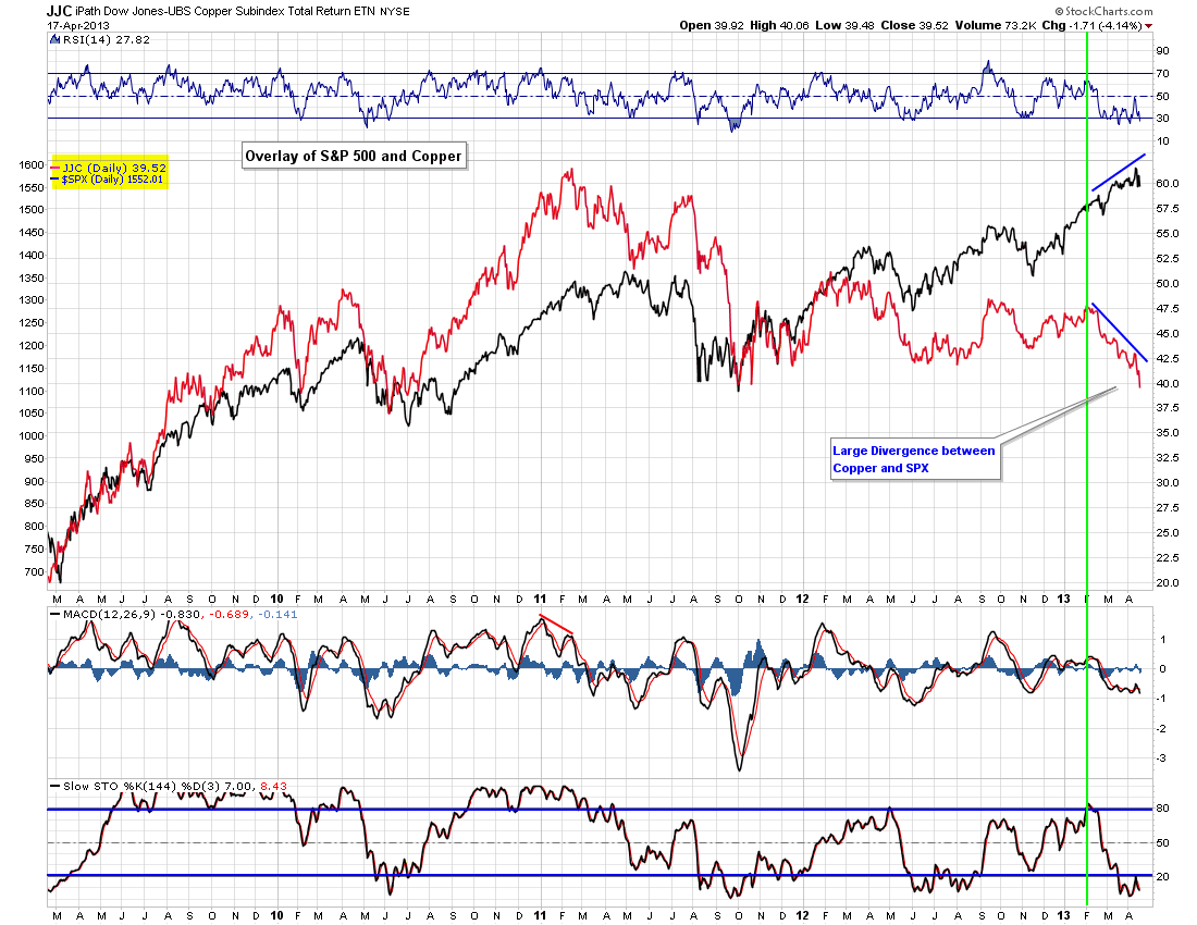
If you've been following my analysis/newsletters, you are well aware that copper broke down from my week triangle pattern about 5 weeks ago and continues to weaken
However the second chart show an overlay chart of Copper (in red) and the S&P 500 (in black). As you can see the two have generally followed each other well over the years, however this huge divergence between the two that has been developing for the last 3 months most likely portends to more downside in the S&P 500 and general market over time.

No comments:
Post a Comment